Banqer
Branding, Website, Web-app
My involvement in this project
- Co-founder
- Branding
- Visual Design
- Website Design
- User interface Design
- UX and Testing
- Marketing Design
- A dash of css, js, html
Banqer is a financial education platform providing students with a hands on environment to engage with financial concepts in a safe and fun way. Banqer Primary is used in more than half of all NZ primary schools, with Banqer High gaining swift uptake in secondary schools after its launch in early 2020.
As co-founder and design lead it has been my primary job to develop the branding, user interface design, and to help deliver that to students and teachers across New Zealand and Australia.
Banqer has grown a lot since the early days, the look and feel have developed in line with the interface, with a focus on being clear, easy to use, and aspirational. This case study explores various user interface elements throughout Banqer High while briefly touching on the parent and sub-brands.
It's a Flying Pig
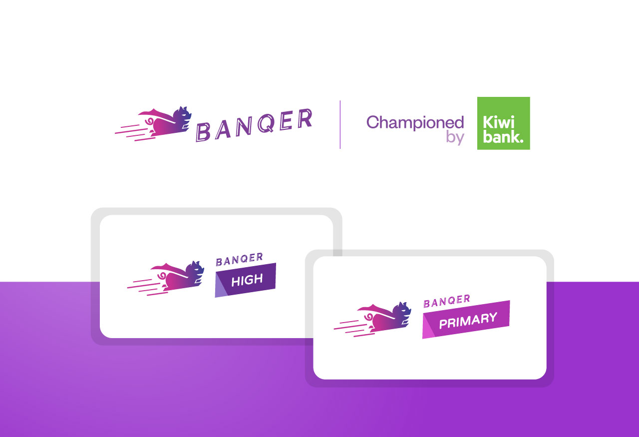
The Banqer brand has evolved to house a 'Championed by' lockup, and two sub-brands, 'Primary' and 'High' each for their respective target markets; these were developed to stand alone or alongside various partner logos. Rounded sans-serifs and angular blocks of colour complimenting the original wordmark.
One Step at a Time
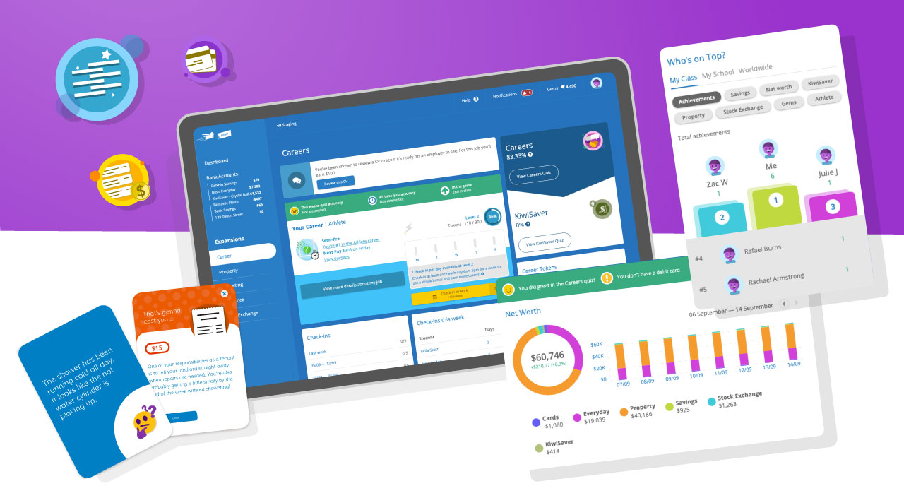
The experience has been designed to actively inform both our teachers and students about the next steps that need to be taken; as well as how they are progressing in each learning area or expansion.
This is achieved through a system of progress charts, info tables, action panels and in-app notifications; each implementation designed to be as helpful and minimally intrusive as possible.
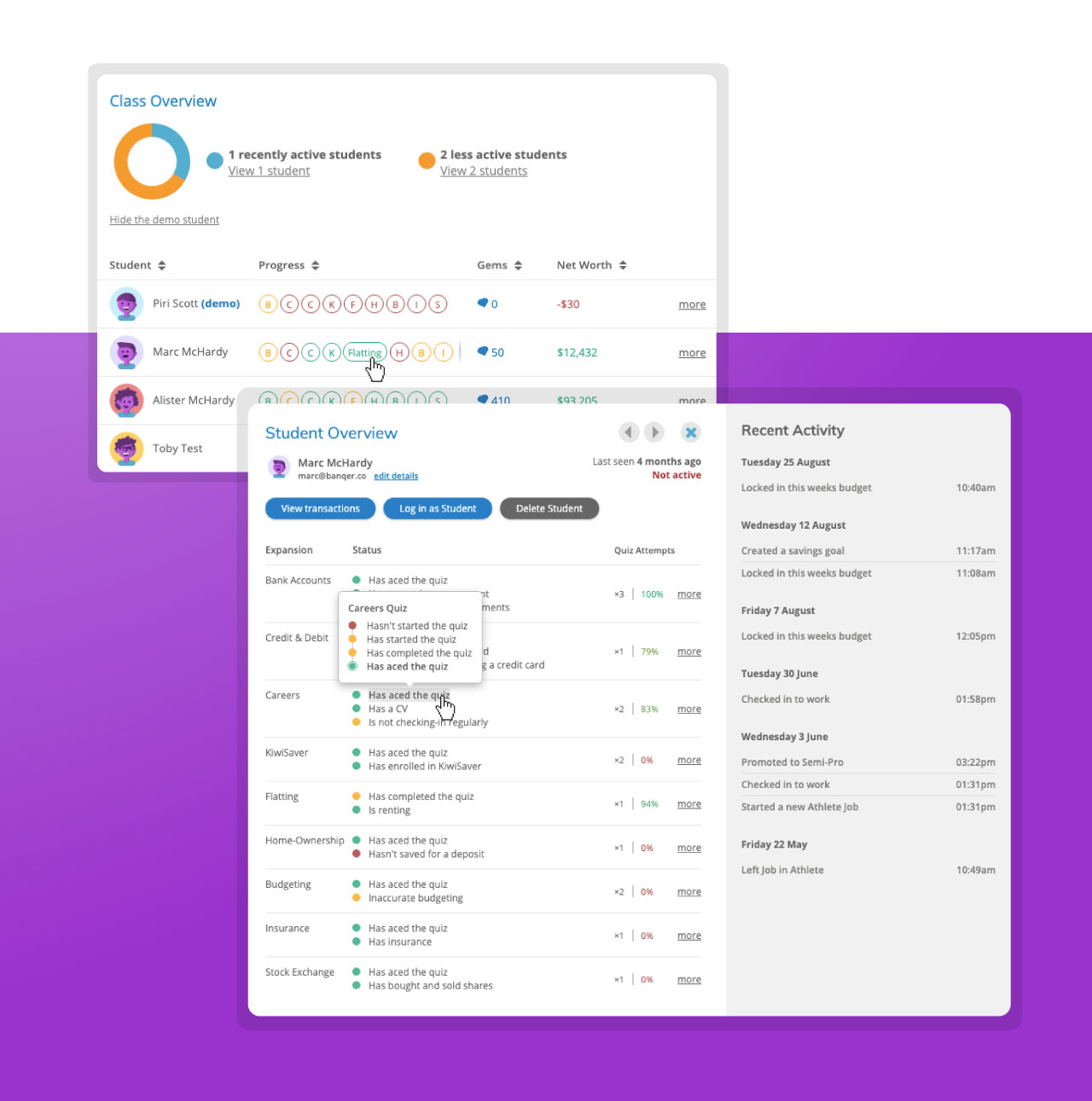
At a Glance
An interesting challenge we faced was effectively communicating to teachers at a high level how their students were doing at any point in time.
From their dashboard teachers are able to glance at a class overview chart where student progress and 'health' within each expansion is indicated through a coloured circle. By clicking through on a student the teacher can access a detailed breakdown of each learning area, as well as recent activity in the student overview.
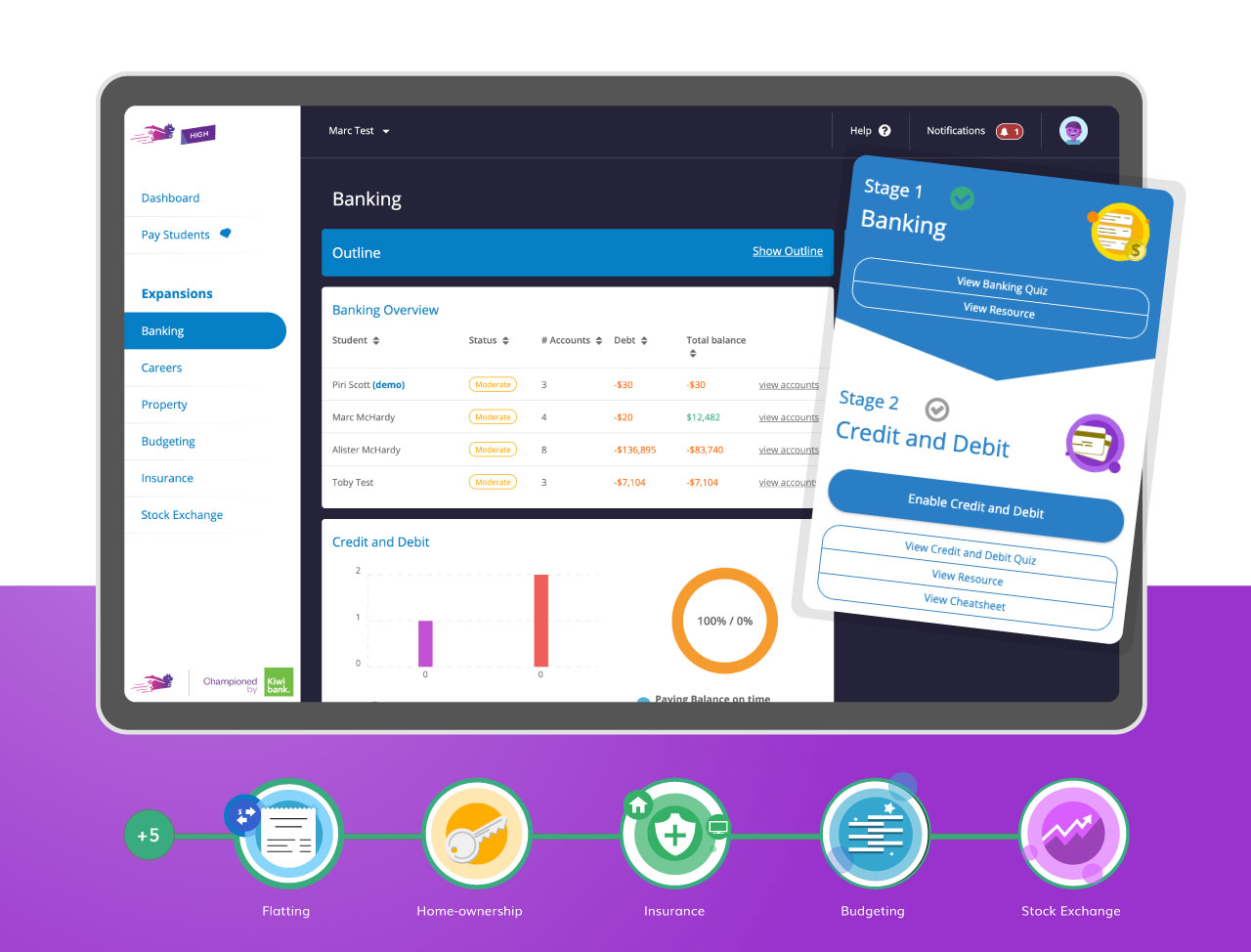
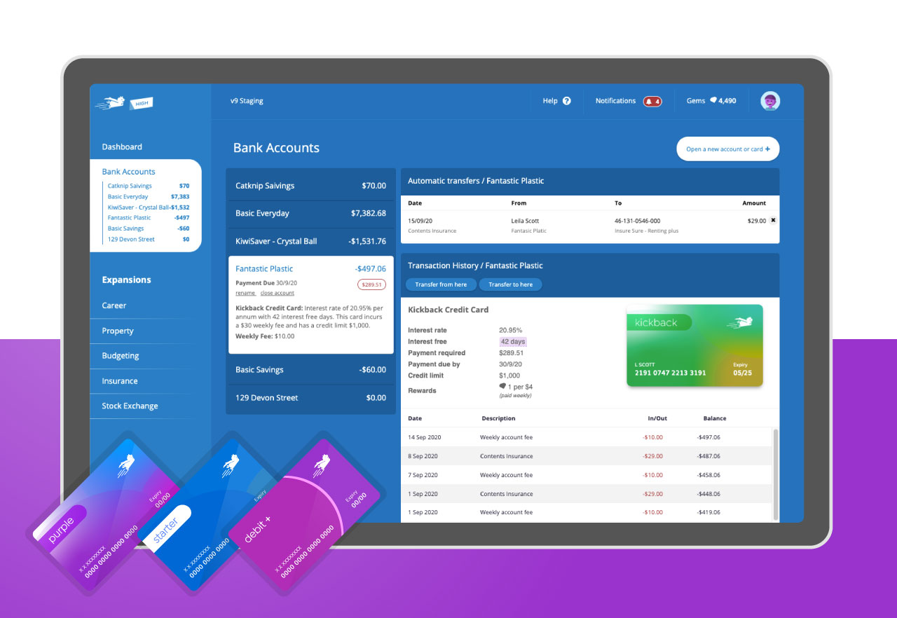
Interest Rates & Account Fees
Students are faced with managing various types of expenses as well as saving for a house, retirement, and for items they may wish to buy from the class store. Setting up and managing different types of bank accounts, including credit cards is just part of the experience.
This area of the app was designed to be as lifelike as possible, with the exception that it is highly informative of what strings come attached with each account. We want the students to get a taste of real life banking but with only a few surprises.
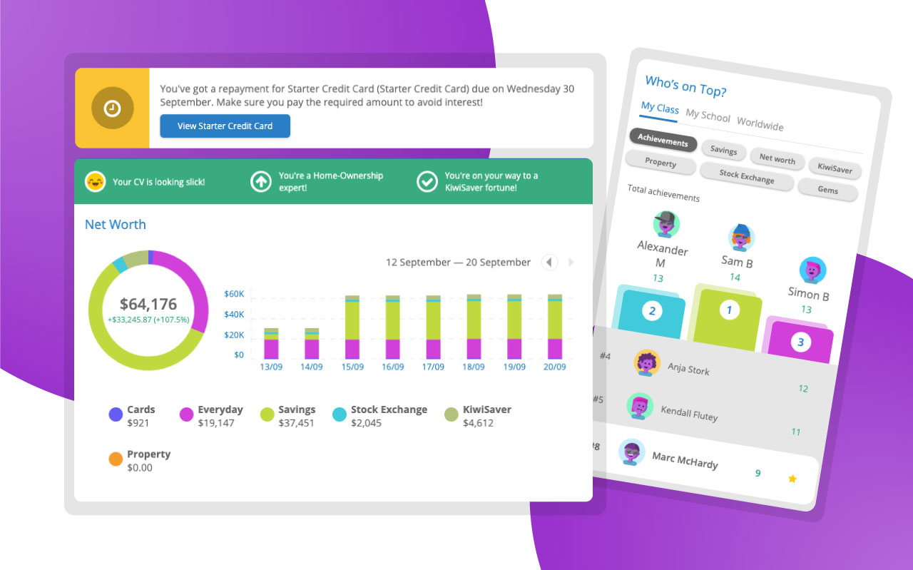
Front of the Pack
The student dashboard highlights a student's net worth breakdown, with a green status bar providing motivational messages or tips on how to improve. In-app messaging is constructed to be both helpful as well as educational.
Leaderboards have proven to be extremely popular with students as they strive to reach the top of each category. It is by design that there are multiple categories, this is to give students as much opportunity as possible where having only one leaderboard may be limiting and demotivating.
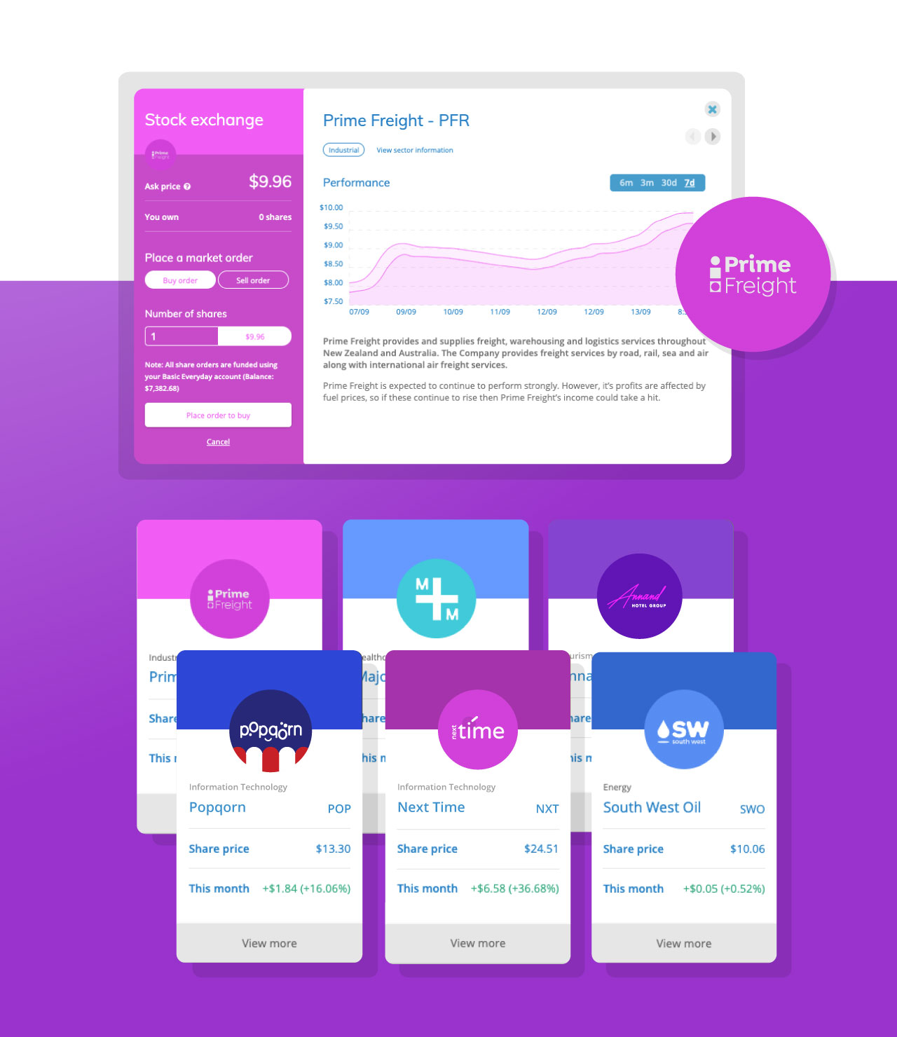
Virtual Stocks
Banqer High has its own stock exchange, the BHX where students can buy and sell shares, lose and make money, experience an IPO, and all of the learning that goes with it.
The challenge here was to communicate with students in terms that they can understand without overloading the UI with helper text. We met a good balance with descriptive labels, more info '?' buttons, and well constructed teacher resources.
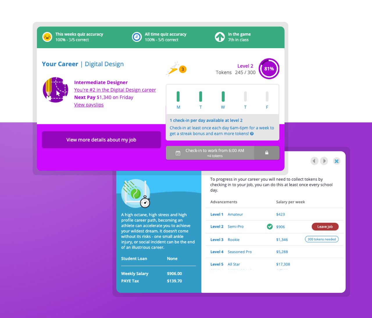
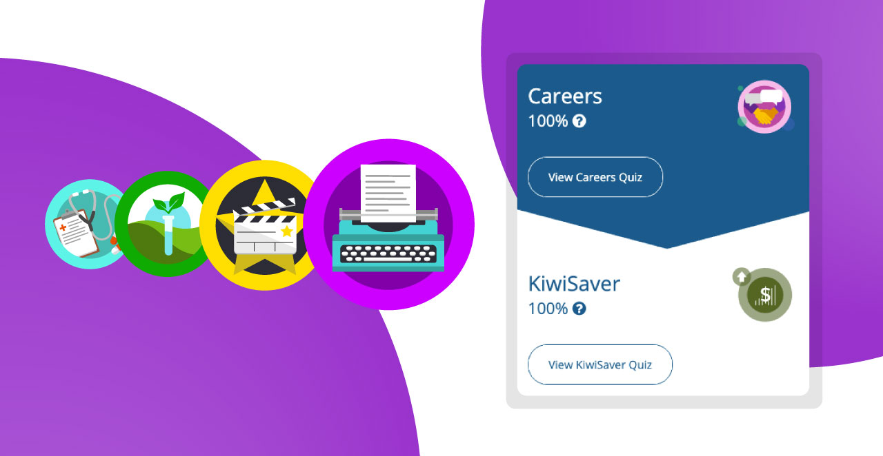
Career Progression
A large part of Banqer High is starting and progressing through a career, and learning about tax, KiwiSaver, and student loan contributions.
We've made this engaging through the use of fun iconography and quizzes that the students take as they start out with each new expansion.
The Daily Check-in
To progress through a career in Banqer High students Check-in one or more times a day where they are faced with a career related quiz question.
The challenge here was to communicate with students their check-in status, how many check-ins are required per day and week, as well as when they will level up in their career. There are a lot of moving parts and this did take some refinement before we hit the sweet spot. The check-in table has been modelled off popular fitness trackers and easily expands as a student levels up and gains more check-in opportunities.