Wellington On a Plate
WOAP Food Festival Website
My involvement in this project
- Ideation
- Front-end, html, css, js, php
- Technical direction
- Product & client management
We brought Wellington's favourite food festival up to date, first step, the famous burger finder.
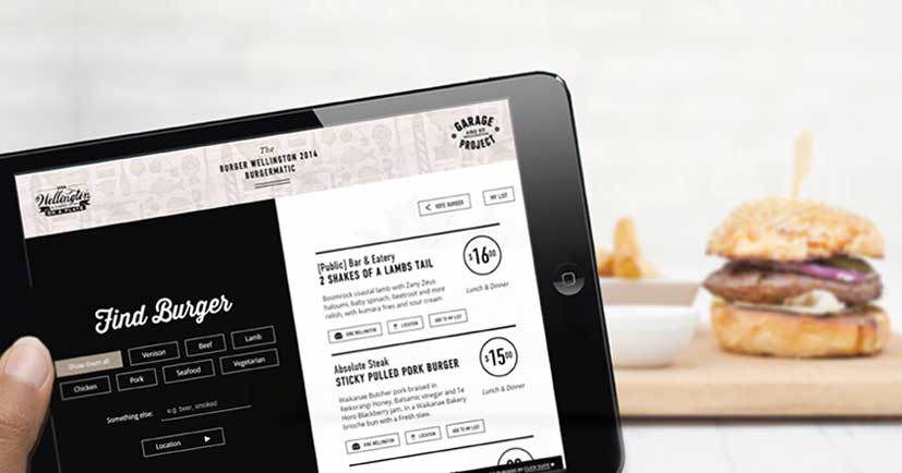
As an eager Burger Wellington fan, Wellington on a plate came into my life in the form of a two week burger binge each year. After seeing burger planning spreadsheets make their way across twitter and through various social circles, I got to work and Wellington's first online burger finder and voting system was born.
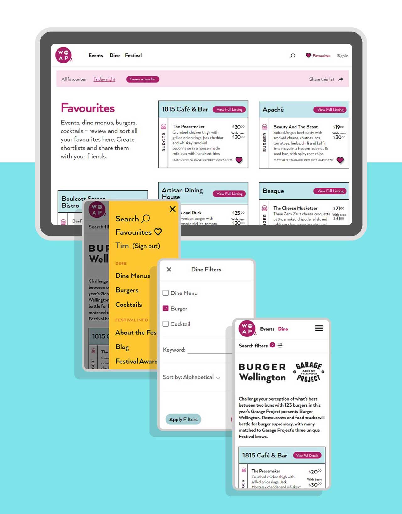
I worked with the team at WOAP for three years while at Click Suite. In that time, we took an outdated wordpress setup and modernised their website with a focus on clarifying their offering, making the website mobile friendly, and helping to bring the back-office tasks online to streamline content creation and cut double and sometimes triple handling. We also saw the creation of an all new web-app that focussed on discovery, list creation and sharing while keeping the voting aspect close to the core of the experience.
Keep It Simple
After we refined our concept, the initial burger finder was built in 2014 utilising AngularJS and a google sheets backend. This allowed us to move fast and make changes as needed. We saw desktop usage skyrocket during business hours (especially around lunch-time) and mobile usage take the lead during the weekends. This type of tracking would help us make key decisions when moving forward with the rest of the website.
It Starts With a Plan
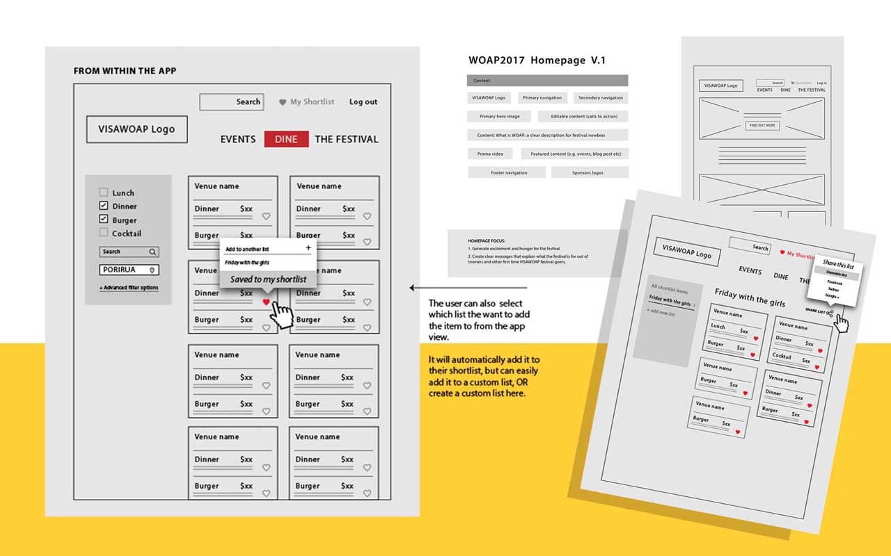
2017 brought with it WOAP's biggest update yet. Emma Martin lead the UX work on this project; qualitative surveys and extensive user experience planning, wire-framing and iteration ensured we moved forward with confidence. By prioritising key aspects of our deliverables, and setting clear milestones we were able to have ux, design, and development run in parallel to meet a deadline that was fast approaching.
More Than a Fresh Coat of Paint
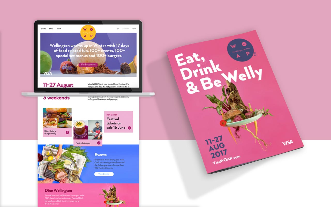
Tim Denee lead the visual design on the initial refresh, with a focus on standardising the look and feel, pulling across key design elements from the print magazine.
A centralized content management system was used to populate these pages as well as the web-app, this content would then go on to be used in the magazine, streamlining back-office tasks and minimizing the chance of outdated content making it out into the wild.
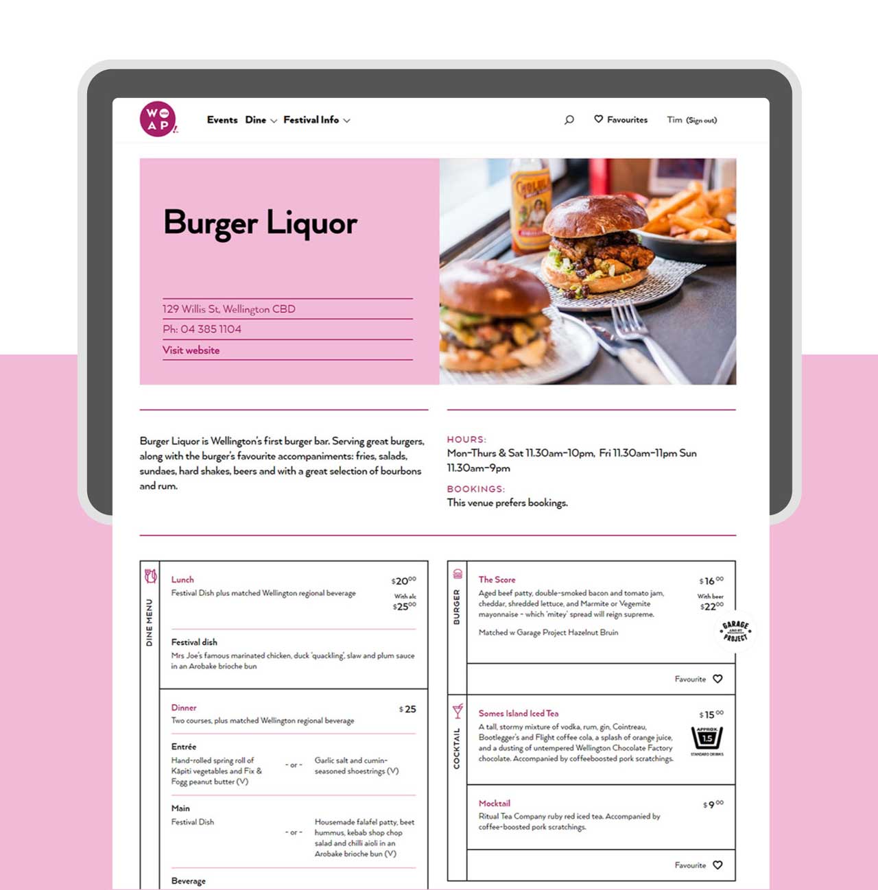
You're my fav ❤️
Alongside the UX and visual design, Patrik Niebur set about building the brand new web-app. Built on react and firebase, we could efficiently manage user accounts, lists, and scale as needed when the pressure was on.
My involvement across the 2017 iteration of the website was mostly product and client management based, with a decent amount of front-end programming. All-in-all I'm incredibly proud of what started out as a humble burger finder and how it's continued to grow after my involvement ended.
